Create an impact with rebranding to uplift lives
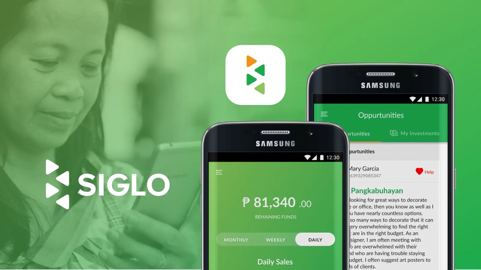
- Siglo, Alvin Kingson Tan
- 2017
- 6 months
- Branding, UI, visual and web design
- Android app, website
💡 Context
Siglo is a social enterprise headquartered in Manila, Philippines. Siglo Retail provides economic opportunities for disadvantaged populations through technological solutions that foster entrepreneurship, community cohesion and local trust.
The mobile app is an integrated e-payment ecosystem centred on prepaid mobile reloading. It collects and organises data to improve Filipinos’ access to capital, opportunities and information. Combined with technology-based education and training, the platform equips users with tools to create opportunities for themselves and others.
💼 My role
I was the only designer, working with the developer team and the project manager. My responsibilities were:
- Branding
- UI design
- Visual design
- Web design
🔍 Research
I didn’t run extensive mobile app research. Instead, the CEO and CTO explained the app’s goals, flow and requirements. For the branding, I created a Visual Branding Proposal, and it was approved on the first submission. The client also gave me the website’s content list and the pages it needed, so my main focus was UI design for the mobile app and the website.
We kept iterating in weekly discussions until the app launched and the website was finished.
💭 Validation
The developer showed me their first prototype of the app. The UI was plain and the design was basic, and the existing branding wasn’t engaging. The development team had put usability first, choosing simple, usable design over complex illustrations or visuals, and I kept that priority.
🤔 Problem
After gathering this information, the focus shifted to improving the branding, the social media presence, the business collaterals and the website design. The key questions were:
- How can I improve the brand so it fits what they need?
- How can the mobile app support mid-range smartphones with streamlined navigation, so users need fewer steps or taps? A good reference is SMS-based transactions, which only need a keyword text.
- How can the website have marketing that is straightforward yet effective?
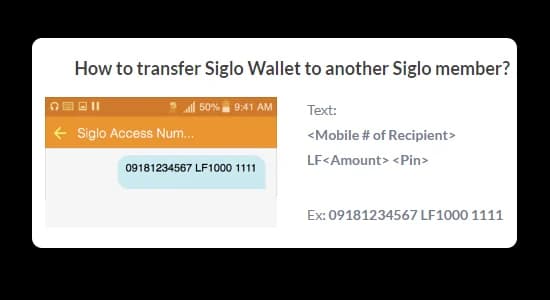
The SMS reference: one text with the recipient, the amount and a PIN.
⚡️ Approach
I created wireframes from my initial sketches. I didn’t produce low-fidelity wireframes or detailed specifications, because the client had already given me the complete mobile application flow.
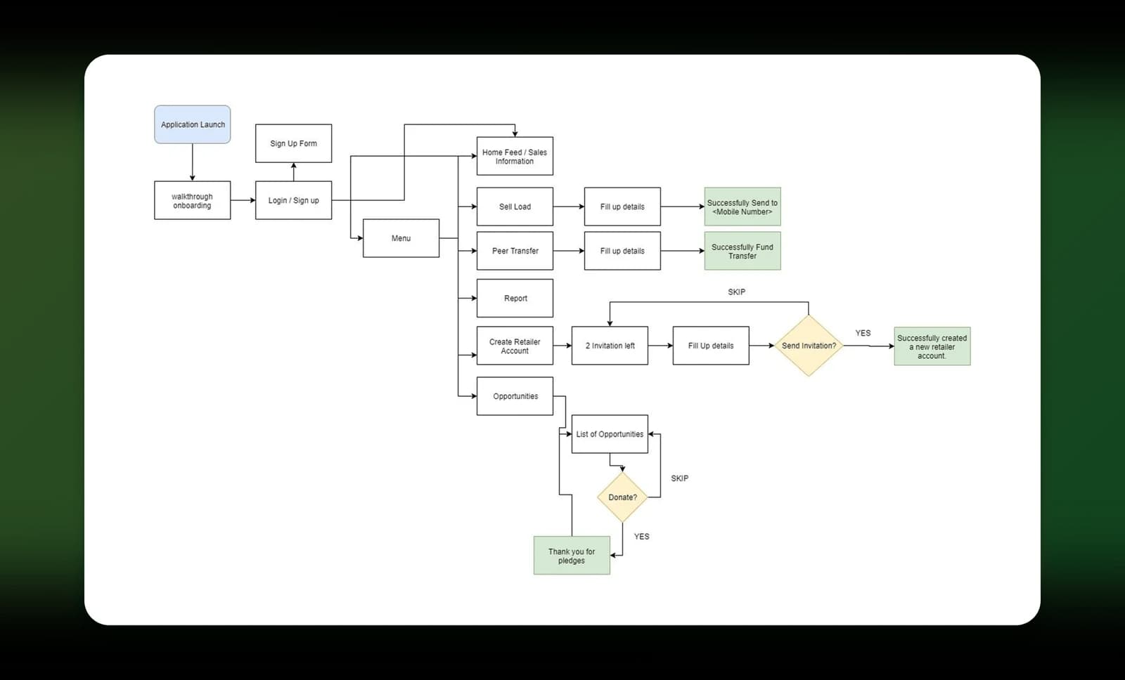
The complete app flow the client gave me.
I no longer have the original wireframes: the laptop I was using at the time was corrupted, and I had no backup.
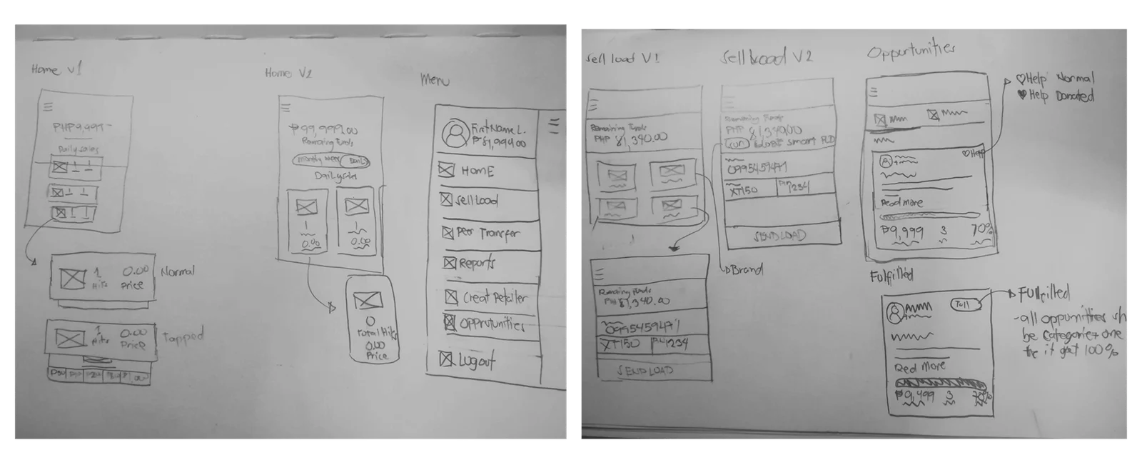
My early sketches: two home layouts, the menu, two sell load versions and opportunities.
💖 Output
Brand strategy proposal
I explained the logo concept: a pyramid that reflects the networking goals, but focused on referrals within the mobile app. The proposal covered the colour palette, brand patterns and photography usage guidelines.
The deliverables were the logo concept, a colour system, a brand pattern, photography guidelines and business collateral.
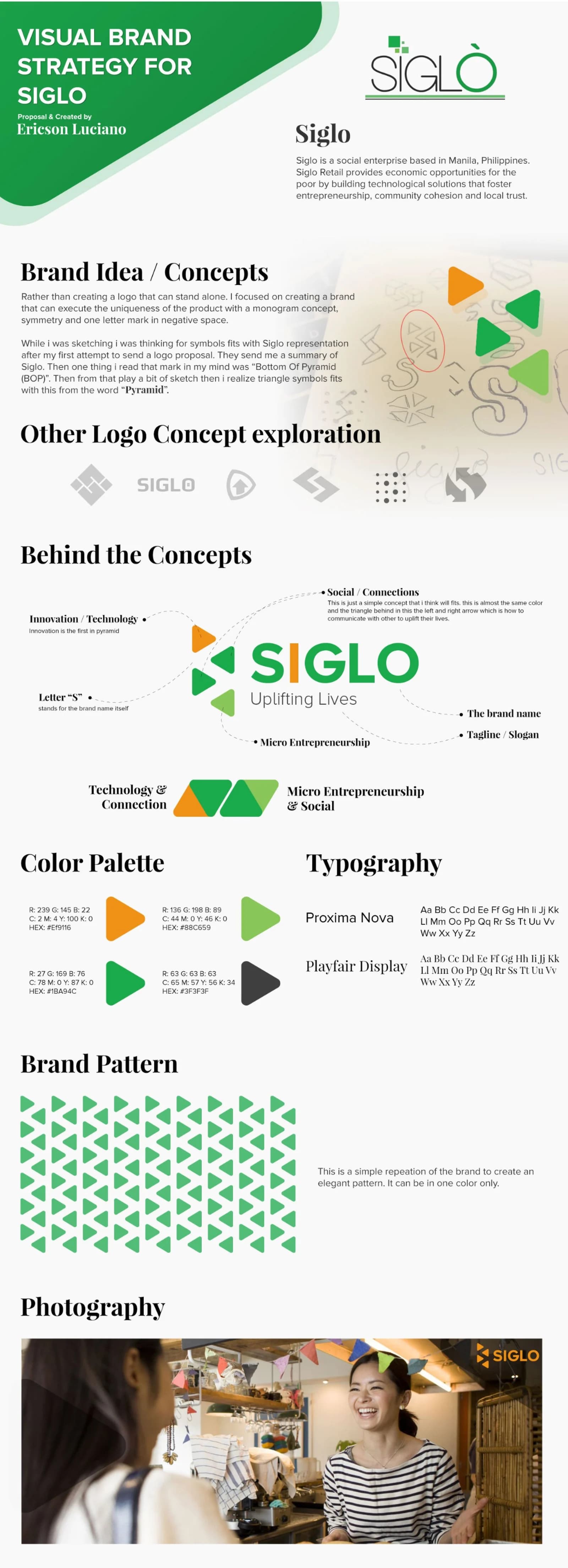
The brand strategy proposal.
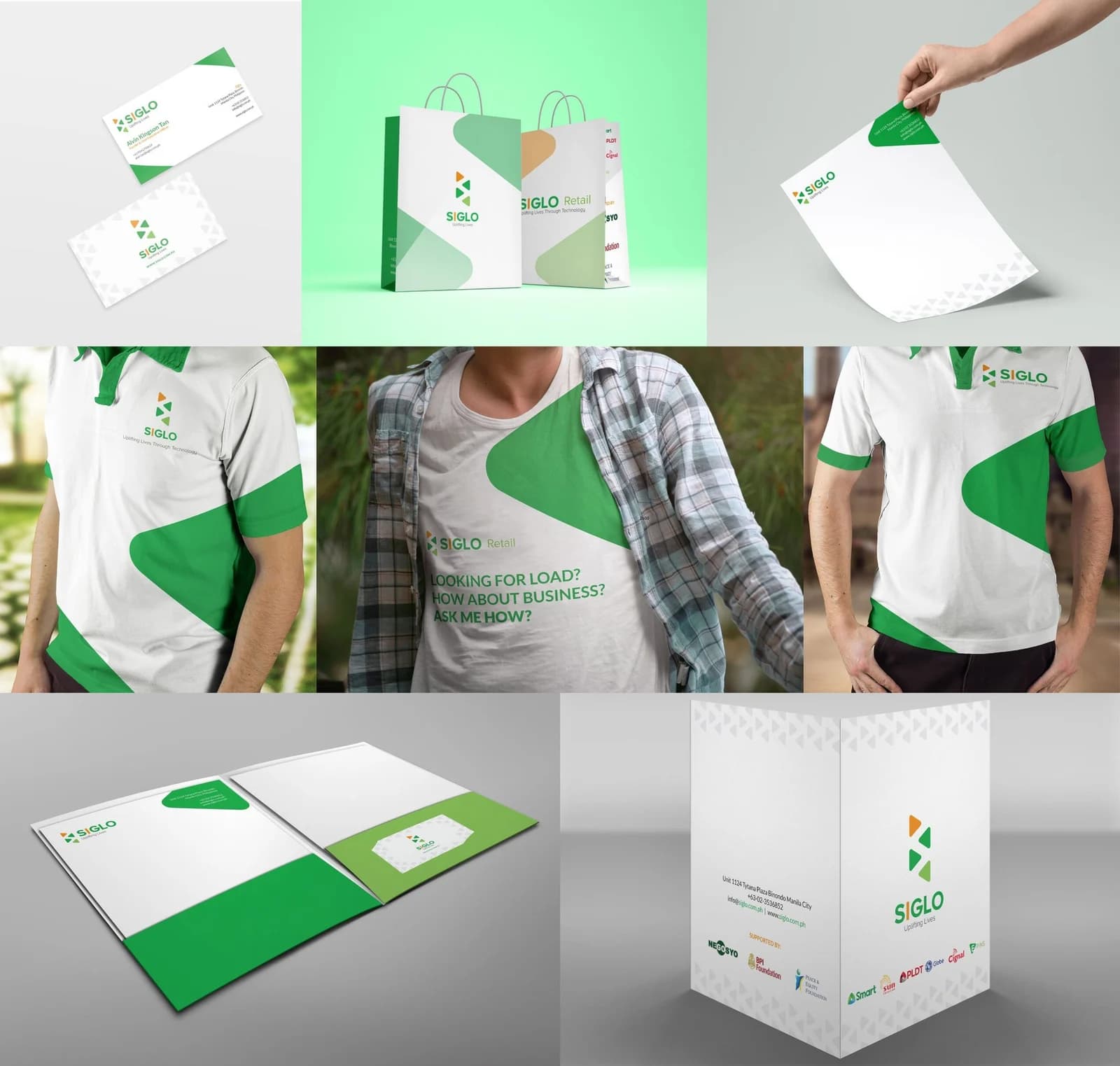
Business collateral.
Website
A complete website design, with the full look and feel.
Mobile application
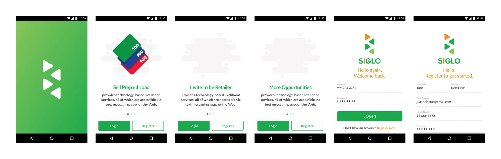
Splash, onboarding and login/register. I focused on the first onboarding slide; the other slides were still in development. Login uses the mobile number as the username, for security and uniqueness. Registration collects the basics: mobile number, name, email and password.
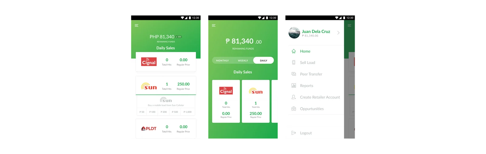
Home screens and menu drawer. I designed two layouts. The vertical view shows more detail, with quick access to top up regular load. The horizontal view is built around analytics, showing load pricing and how often it is purchased (daily, weekly, monthly). The client chose the horizontal view, to emphasise the monthly, weekly and daily analytics over earnings tracking or quick-access features. The menu drawer shows the total earned amount, the user’s avatar, full name, a profile indicator and quick navigation.
Peer transfer. Peer transfer lets users move money. Retailers can request payment for load instead of handling cash, and users can create accounts for other people and transfer funds to them.

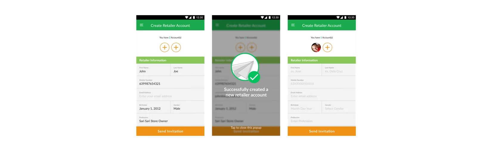
Invite retailer. This flow could be better: it should show the invited retailer’s details, track each retailer’s earnings, and explain the MLM-style referral earning structure.
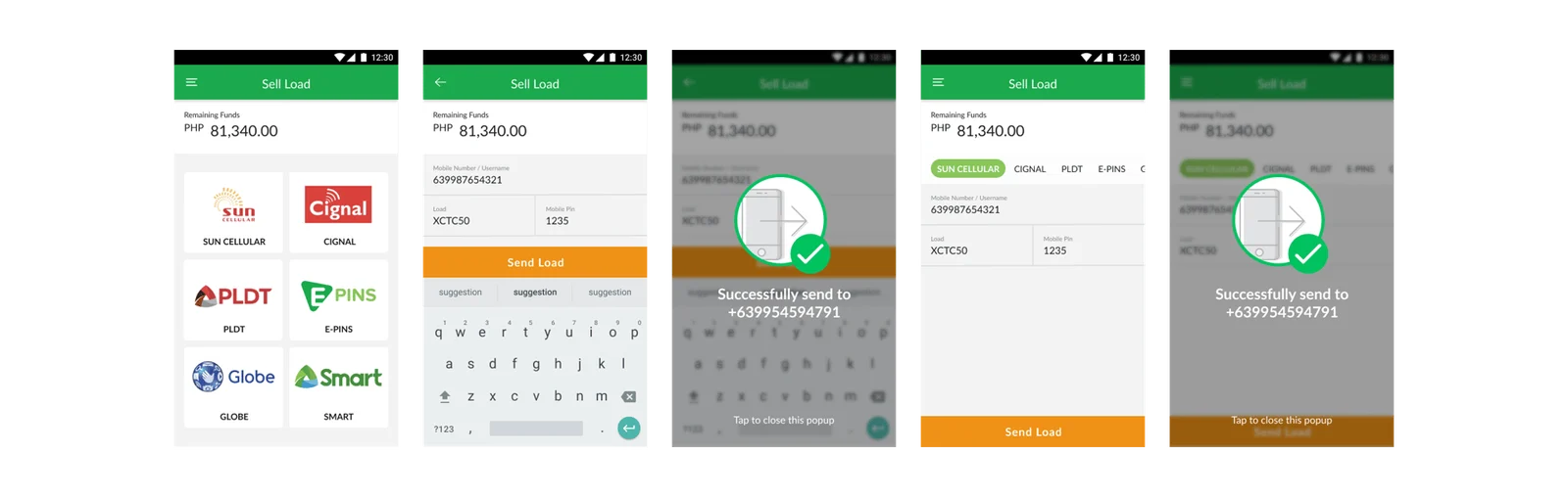
Sell load. I designed two versions with the same flow but different navigation. The first shows the available network providers first, which costs one extra click but needs less thumb scrolling. The second uses a horizontal carousel with all the network providers, which means fewer clicks but more scrolling. We went with the first, because Siglo’s users are mostly 40 and older and mostly non-technical, and the logos and branding help them identify each network.
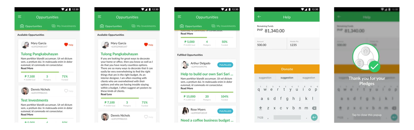
Opportunities. Opportunities works like a small crowdsourcing platform that helps users fund their small business goals. The “Help” button stays grey until it is activated, and the screen shows the target funding amount and how many supporters have pledged funds.
✨ Lessons learned
My work focused mostly on UI design, and there were real gaps: not enough user research, no personas and limited ideation.
Even so, the first iteration reached about 2,000 downloads on the Google Play Store. The app needed ongoing improvements. Both the app and Siglo have since closed, and I don’t know what happened after the first design iteration.
What I would improve:
- Enhance the Opportunities flow.
- Run usability testing and validate ideas.
- Design stronger success states.
- Improve the invite retailer flow: clarify the earnings potential, and show referral profiles and earnings tracking.
- Add QR code scanning to peer transfer.